
Al Held: Alphabet Paintings
Cheim & Read, New York
April 2013
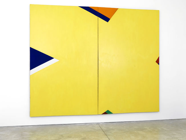
Al Held’s paintings of the early to mid 60s are now on view at Cheim & Read. In them, he abandons the physical monumentality previously achieved through the accretion of heavy layers of oil paint in favor of a more visual, graphic monumentality. This graphic monumentality comes from vigorously painted architectonic arrangements of letterforms painted on near-mural scale canvases.
Held denied a metaphorical interest in the letters; nevertheless, the pictorial device of singling out initials for monumental treatment has precedent, most notably in Celtic illuminated manuscript painting, where the scale and lavish decoration of the initial letter alert the reader to the import of the text that follows. Through their intricate design, these “initials” require concentration and pull the reader into a meditative state. They also function as visual thresholds opening outward and inviting the reader to consider the sacred worlds beyond the boundaries of the page and of earth, itself.
In much Abstract Expressionist painting of the 50s, notably paintings by Rothko and Newman, expanded abstract visual fields reflect the viewer’s gaze, conjuring an awareness of self. John Yau, however, recently noted that the forms in Held’s early 60s paintings, such as The Yellow X, extend beyond the picture plane, creating an awareness of the environment beyond the canvas edge. “Extending off the painting’s physical edges,” Yau writes, “the X is simultaneously skewed and stable, conveying a space that hints at a realm beyond and behind the picture plane.”
Making paintings that pointed outward, thresholds onto the physical world, was a stated interest of Held’s. He accomplished this through drawing, as described by Yau, and also through color. Held himself noted, in a 1975 interview with Paul Cummings, that he was interested in “‘taxicab’ colors, loud, crass” – the colors of the city.
More of Held’s and Cummings’ discussion of the “Alphabet” paintings is below:
Excerpt from: Oral history interview with Al Held, 1975 Nov. 19-1976 Jan. 8, Archives of American Art, Smithsonian Institution
Al Held (AH): “I was very much against that whole “flatness”, the whole Greenberg thing of flatness and wanted to break the picture surface… There has been a constant theme there of wanting to advance that space, wanting that space I always rejected that whole notion of the picture surface as being crucial. But I would spend lots and lots of time on one edge, for instance. But the only way one could do that would be to invent a subject that wasn’t simply an abstract theme. A specific subject that this thing —
Paul Cummings (PC): How do you differentiate between subject and theme?
AH: Well, now I’m using the words loosely. I just simply meant by that, thematically, stylewise the circle and the square, that the subject be specific, that it really have a very, very specific relationship. It wasn’t an example of a notion or an idea; that is, it took on its own meaning, it had its own concreteness.
PC: Was that what the letters of the alphabet meant, you know, the “A” or the “I” or whatever it was?
AH: Right. They were geometric; they had the advantage of being geometric and clear. I wanted that clarity. But they also had the advantage of having — it wasn’t the literally presence, it wasn’t the literal meaning that it took on a configuration that was acceptable. That’s not the proper way to say it. . . You could relate to it as a form. The “A” —
PC: You mean the history one has of looking at the letter “A” in printed and various ways?
AH: No, it wasn’t literal in the sense that I wasn’t interested in the history of the letter “A” and how it moved from one thing to another. I was more interested in simply using it as a generalized abstract image that then I could make very, very specific. But it wasn’t an eccentric form. What I mean by “acceptable” is that you didn’t have to wonder what that was.
PC: So you didn’t use the Cyrillic alphabet, for example.
AH: Right.
PC: You could see it was a “D” or an “I” or an “A”.
AH: Right. But then beyond that you can grasp the configuration. But then I had no desire to have any kind of real literal subject. Somebody once asked me whether I used all those letters because they are the letters in my name in a kind of egocentric. . . And thinking back on it, I have used an “A”, I’ve used an “L”, I’ve used an “H” and an “E”. I’ve used all the letters in my name.
PC: A “D”.
AH: But it was not a conscious thing at all. I have used “X”‘s too. But the point I’m making is that they were used for formal devices to make something very concrete, they weren’t used for literal purposes.
PC: Now one of the other things about those large paintings is that the colors changed enormously from the early ones.
AH: Right.
PC: Was that because of the colors available in the Liquitex?
AH: That. And also the reaction to that show and also wanting the “taxicab” colors, loud, crass. And also in those days there was a great deal of talk between myself and George Sugarman about contrast of forms, of lots of contradictory forms, a multiplicity of forms. It’s like this painting here, it’s got a geometric shape there in red and it’s got the I-Beam and it’s got the yellow stripe and it’s got a wave. It’s got a juxtaposition of different elements in the same painting and the semantics of that kind of using disparaging forms. But that evolved out of that very quickly in the sense that I remember saying to myself: well, if I can paint a crowd _______ can’t I paint one person. You know, that kind of thing.
PC: Thinking of the painting in that vein, did you have a hard time keeping it together when it was evolving? By that I mean would, say, the wavy section jump out or pull back?
AH: That’s what all the struggle was with all the colors and the drawing, to keep that thing together, under tension in the relationship. They weren’t simply signs or symbols placed there like —
PC: The surrealists —
AH: Right. There had to be some kind of structure to pull them all together. That’s why all the time was spent on finding the right color weight. That’s what all those color wights are really all about, keeping things together, keeping the relationships together, keep it under tension so it wouldn’t jump out and become a whole bunch of potpourri. But there were lots and lots of notions like that. It’s hard to remember all the ideas you were so excited by because they’re sort of like left behind. But they’re not really left behind, they’re sort of like part of an iceberg but only the things you’re concerned with now. Those things I’ve already absorbed and they’re part of me. And I’ve left them. I sometimes theorize that what an artist really talks about are the thing he’s can’t do.