
Joanne Freeman: Three Chords
Maine Museum of Art
June 21 – September 21, 2013
Although Joanne Freeman’s paintings are austere in their means, they nevertheless communicate with vivid clarity. In her recent work, a richness of color, specificity of light, and a languid sense of movement arise naturally from the painting process. As noted by curator George Kinghorn, in his introduction to Freeman’s current exhibition Three Chords, the “forms that inhabit these canvases (several of which are elegantly shaped) create dynamic interactions—the hard-edged thickened lines quiver, rotate, stretch and sag.” Freeman and I recently discussed her new work via email.
—Brett Baker
Painters’ Table (PT): Looking at your recent paintings, I’m struck by both the reductive formal language in the work and how that language refuses to remain self-referential. The paintings seem to immediately point outside of themselves, if not to specific things, then towards familiar spatial experiences and physical forces. Are these qualities byproducts of the painting process or are you responding to specific visual input, either directly or from memory?
Joanne Freeman (JF): The reductive formal language is my structure. By creating boundaries and limiting choices, I’m able to amplify whatever qualities are represented. I assign a lot of importance to visceral responses and am less interested in content and literal analyzation. I am wary of consciously using too much self-referential language as it seems to show up anyhow, often uninvited, in the studio practice. I’m pretty aware, when I paint, of the historical precedents I’m referencing and the language of modernism, in both two and three dimensional form. I go back and forth borrowing and riffing on it. Specifically, though, a large influence on the language of the recent paintings was inspired by a trip to Otranto, Italy that I took during a residency with the Bau Institute. I was blown away by the shadows and light on the white facades of the buildings. Isolated colors against this backdrop became incredibly intense. The less-is-more quality became really apparent, and I became obsessed with the variations of white and the positioning of color against it.
PT: The specificity of Adriatic light where the darkness of shadows turns to color is certainly evoked in the work, as is the languid movement of shadows in heated air. I think that’s when painting gets really interesting, when the language you develop in the studio draws you to a natural equivalent expression. The work itself allows you to see more intensely.
JF: It’s an interesting dance between the sights and sensations experienced in the external world and your vision in the studio. One informs the other as you’re drawn back and forth between what you’re seeing and what you’re creating. I remember sitting one night, watching the light go down over the harbor. Some of the fishing boats had a singular small light that sat on top of the mast. As it got darker, all you could make out was the thin line of the mast with a small circle of light atop. The circle was slowly and quietly swaying back and forth. As the sky darkened, the image became more and more isolated and abstracted, until finally it was just a line and a dot. The power of the image came not from its vibrancy but rather its humble simplicity.
PT: Your description sounds beautiful, and speaks, I think, of a kind of observation that is natural to an abstract painter. Being uniquely attuned to abstraction enhances the appreciation of a complex scene coalescing into its essential elements – you see the “more” contained in the “less.”
Another thing that stands out in the current paintings, and your previous work as well, is your investigation of non-rectangular formats. What led you to use shaped supports?
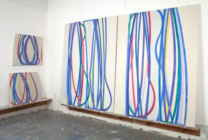
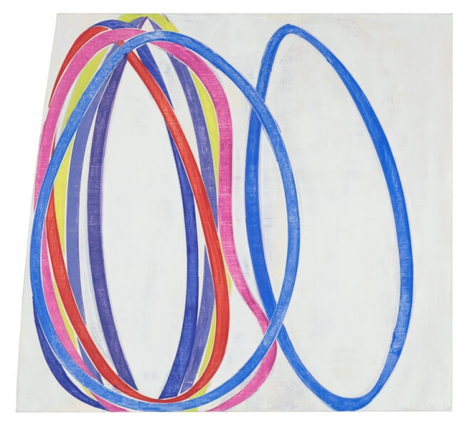
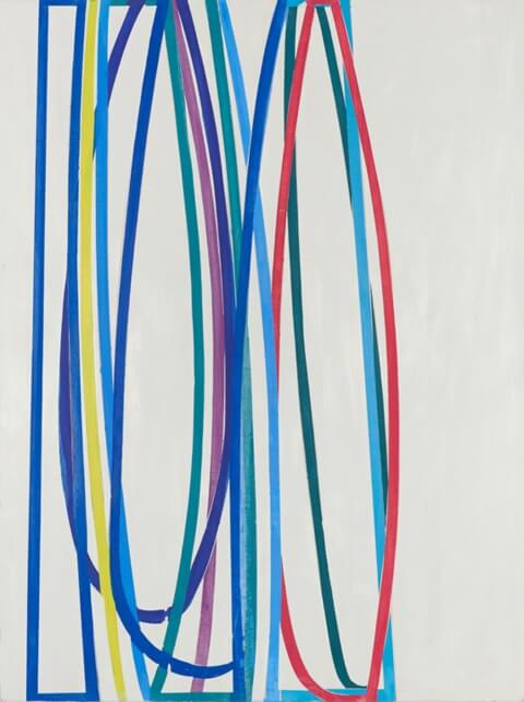
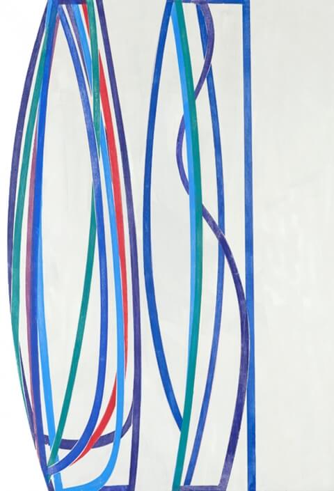
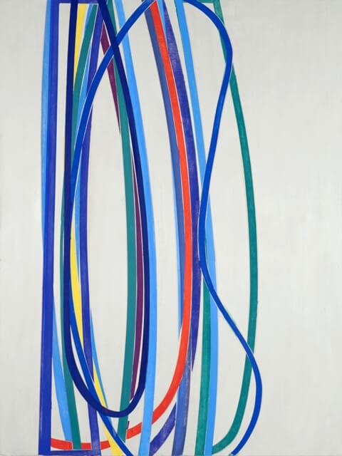
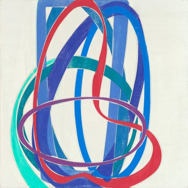
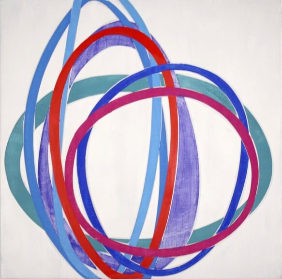
JF: As you have stated, I am also interested in the physical force or presence of a painting. I want my paintings to be read as wholes, where the color, line, and form coalesce. The circular lines in my paintings are made from the sweep of my arm. Their proportions are therefore dictated by my own body proportions. Generally I sweep from one edge of the canvas to the other. Simply put, the exterior shapes of the canvas sometimes mimic and engage with the internal shapes of the paintings, adding to the idea of the painting as an object and questioning notions of two and three dimensional space. I like the duality and absurdity sometimes present when pretty rigid language comes up against a spontaneous gesture.
PT: The supports themselves feel spontaneous and gestural.
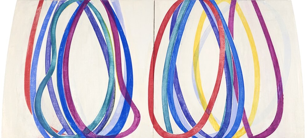
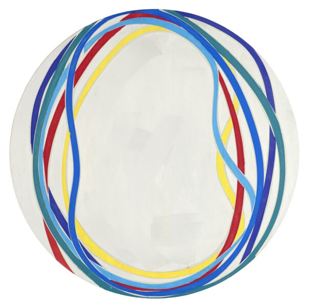
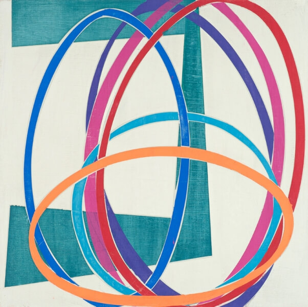
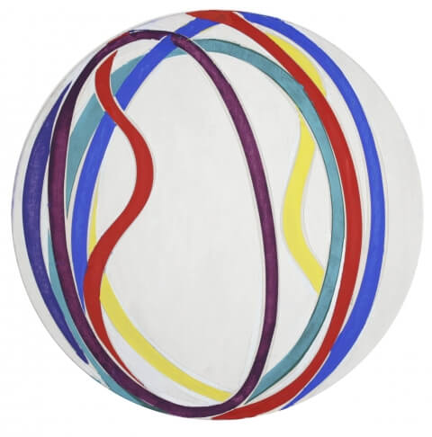
JF: I like that, although the supports are measured and planned out beforehand, the curved edges do undermine the right angles. I’ve been told by viewers that they haven’t noticed the odd shape of the canvas right away. I like this ambiguous reading of the form, it pits one’s expectations against what is actually there. The circular canvas, All is not what it seems, suggests a target, minus the actual focal point, with the interior lines reiterating the edge. The supports of the diptych, Three Chords, create an arch with a center support and the interior lines slightly off balance.
PT: It’s true, I don’t think the shaped canvas was immediately apparent to me either. Even though one knows the painting surface must be planned beforehand, the shape of the supports feel gestural because they seem to respond to the gesture, mark, and shape they contain. This gives the internal forms an added sense of force, as if their presence affected the space around them enough to shape it. Most often in shaped painting it feels the other way around, the marks just bounce against a predetermined area or succumb to it as a kind of mould.
JF: Yes, although I’m interested in the painting as a whole I do not want the interior composition to just repeat the shape of the exterior but rather to remain independent and engage with it. The supports are just one variable on a list of many that influence the paintings. My process, though guided by structure and formal language, is really spontaneous. I work on more than one painting at a time, each informing the other, and begin by laying down a stroke, which then determines the next and so on. I have a vague outline of where I’m going, which quickly dissipates with the first set of marks. After that, I’m really in the moment reacting to the preceding stroke and color. At some point, I begin to see where it’s all going and maybe an end point, but usually the bar keeps getting raised on different days with different viewings. Color is the wildcard – as much as you think you know it has a mind of its own, and when you lay it down it can lead you to unexpected places.
PT: Your show is titled Three Chords, which nicely relates the pared down means in your work to the pared down means of a folk singer. The press release offers the example of Bob Dylan. For me, Springsteen’s album Nebraska also comes to mind. In these musical examples and in your work, the expressiveness of the whole far exceeds the expected sum of its parts. The title Three Chords, however, also made me think of Hans Hofmann’s discussion of visual art in musical terms. In his essay The Search for the Real he writes:
The relative meaning of two physical facts in an emotionally controlled relation always creates the phenomenon of a third fact of a higher order, just as two musical sounds, heard simultaneously create the phenomenon of a third, fourth, or fifth. The nature of this higher third is non-physical. In a sense it is magic. Each such phenomenon always overshadows the material qualities and the limited meaning of the basic factors from which it has sprung.
JF: I think abstract art lends itself to these comparisons with music. The tendency to read a painting literally does not endear itself to abstract language and sound. Through the title of the show, Three Chords, I am comparing the simple structure of a song to the simple structure of a painting. The quote by Hans Hofmann is a beautiful description of this process. His comparison of two musical sounds heard simultaneously creating a third is a great metaphor of how a painting builds. For me, the higher third or magic he describes is when the painting begins to take control, causing me to become the viewer, leading me into the unknown.
Listening to music as a kid was paramount in forming my early identity. The music that you listened to became code for who you were. It also marked a time when innocence and energy fueled inspiration. My paintings also form my identity. They are my memories, my experiences and my spirit. Hopefully they also share some magic.