Labor Day has come and gone, the kids are back in school, and as if on cue, hundreds upon hundreds of New York galleries all burst open with their offerings for the new art season. Readers of this column know that I sure do like painting, and what follows are some of my favorite examples that went up in September:
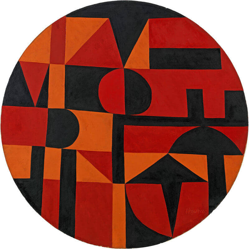
Each and every review of Carmen Herrera’s early to mid-career retrospective at the Whitney will necessarily begin by noting how long overdue this exhibition is. I don’t want to linger on this point for too long in the few sentences I have to offer about these paintings, but I will say this: at 101, she was certainly made to wait her turn. The show was clear-eyed and crystalline, and while it featured some familiar motifs from the repertory of geometric abstraction, a quick check of the dates shows that Herrera often got there way ahead of the pack. The two exceptionally strong black and white paintings from 1952 are a case in point: The concentric squares of Black and White were painted seven years before Frank Stella made his celebrated black paintings, and the strobing stripes and triangles in Untitled were completed a full thirteen years before MoMA hung The Responsive Eye. In the early pictures, made in Paris right after the war, the strong influence of Matisse and Paul Klee is evident, but even here there’s a clarity and confidence that’s seldom seen in formative work. The circular Iberic from 1949 was among my favorites in the show – she negotiates the tricky problem of painting an architectonic abstraction on a round support by dropping in one full circle, two half-circles, and one quarter circle, each the same width as the stripe within which it resides. They reiterate the whole, and voila – no problem. With only three colors, the composition is as neat as a pin, and looks easy even though it wasn’t. I went downstairs afterward and got one last look at the Stuart Davis survey – seeing both those shows on the same day made me happy to be alive.
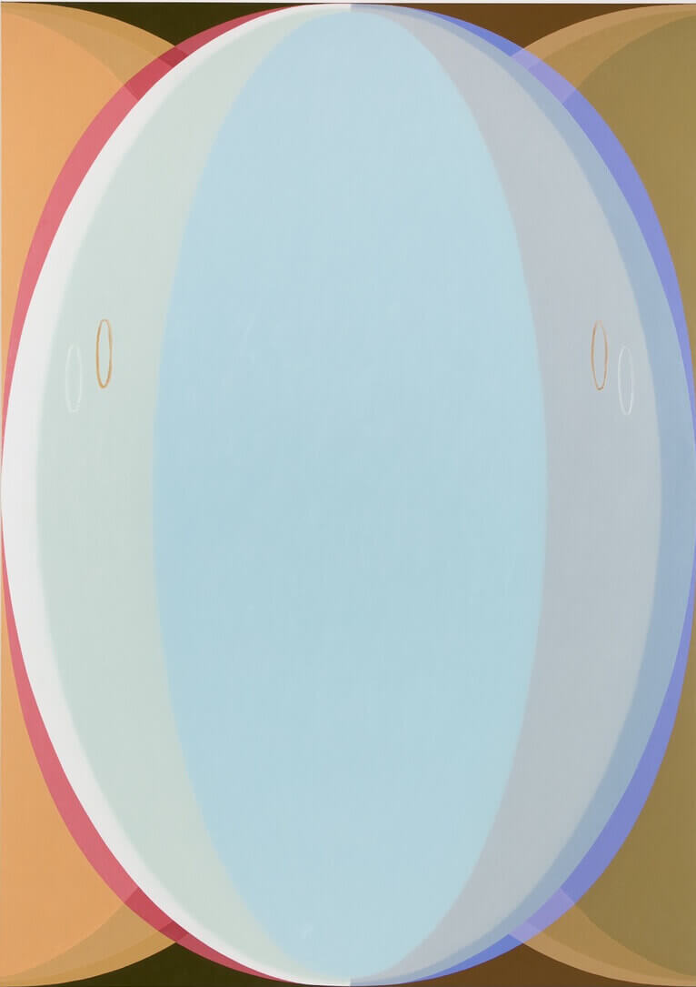
Heather Guertin’s paintings of blank-eyed jellybeans at Brennan & Griffin are playful in the best sense of the word, and at eight feet tall each, just a little scary. De Kooning famously declared that oil paint was invented in order to paint flesh – he was talking about humans, but Guertin makes a strong case that it’s also the perfect medium to paint gelatinous, semi-transparent, genderless beings, too. And the paint seems to me to be the place wherein the real joy resides, certainly for the viewer but also for Guertin herself, with all those marvelous color combinations coming together to create the alternating illusions of transparency and translucency over passages of satisfying, shade-the-egg semi-opacity. My favorite was An Appearance, Blue, in which the egghead was gently held in place by the centers of the four sides of the support. Encroaching on the right and left were partial ellipses in ochre (obscured eggheads?) and the central figure was haloed in magenta on the lit side and blue-violet on the shadow side. There’s so much to look it in the margins that one almost doesn’t notice that a full third of the canvas is covered, right in the middle, with a floating, unmodulated robin’s egg blue, making the bulbous eight-foot figure virtually weightless. Also included in the show were two 2.75” x 8’ canvases – they were an interesting Newman-esque experiment, but not nearly as satisfying as the four big pictures.
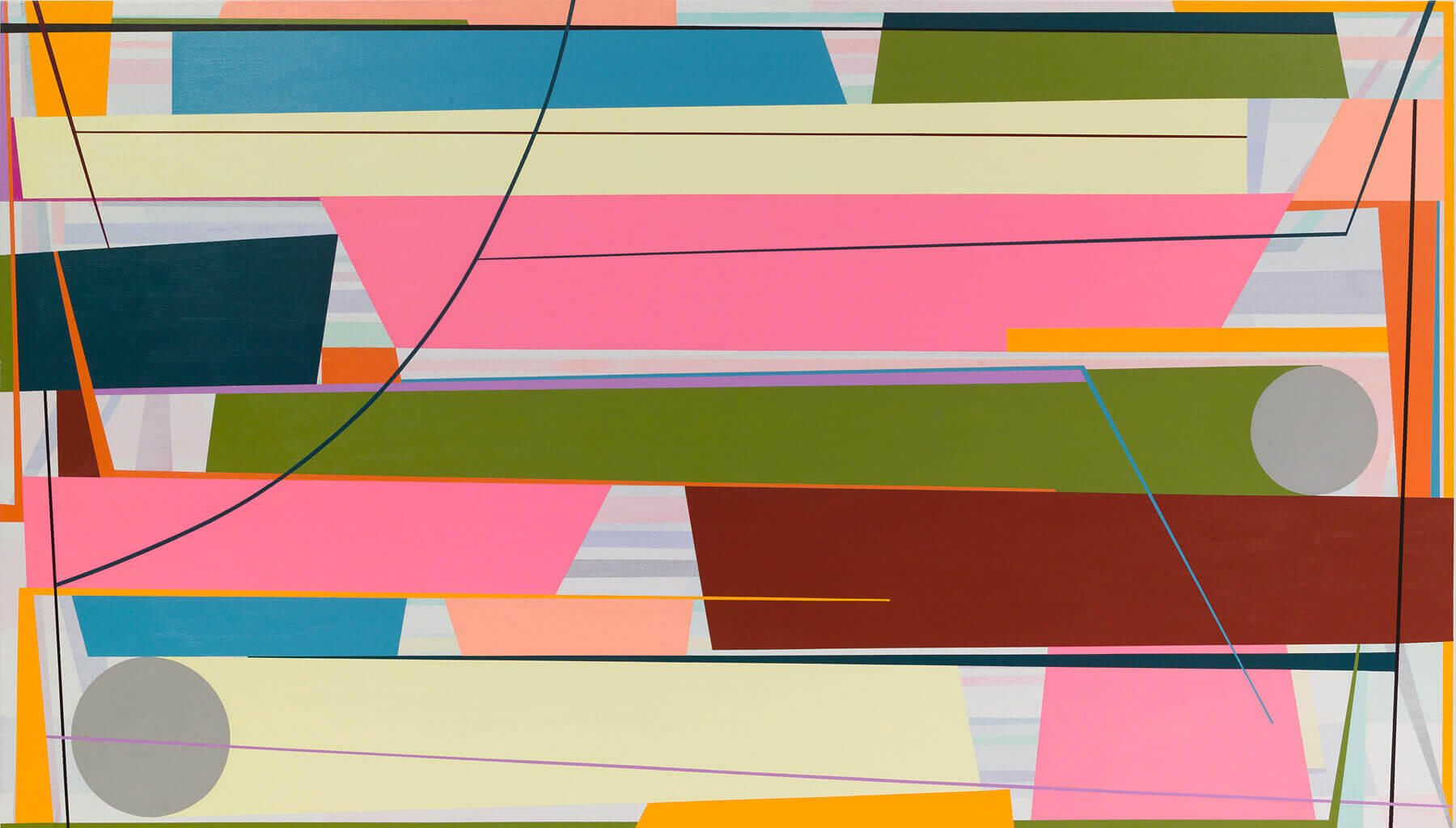
Gary Petersen’s work has taken a real turn in the last couple of years via a seemingly simple addition: horizontal planes now weave their way through his long-established vocabulary of bands and frames. In his current show at McKenzie Fine Art, those planes obscure most of the delicately tinted bars in the paintings’ backgrounds, but oddly enough, they function to make Petersen’s pictorial space deeper than it was before the new shapes arrived on the scene – the overall effect is like looking through small holes in a fence at something vast. Petersen has an intuitive understanding of the visual weight of colors, and as he stacks up his rectangles he unfailingly chooses the right width and hue to effectively counter-balance and support the colors above and below. The compositions work well across a broad variety of sizes, but for me the stars of the show were the three large canvases, which evinced real confidence: Staring at the Sky and Slip/Spill at seven feet tall each, and more surprisingly, Spin Out at four feet high and seven feet across. I’ve always associated Petersen’s work with a vertical format, but the new planar forms, always horizontal in orientation, easily and gracefully stretch out into landscape orientation. This format also lends the aptly titled Spin Out something that the vertical pictures don’t really possess – a speedy motion, emphasized by the two silvery grey circles, one moving quickly right trailed by an olive wake, the other moving just as quickly left trailed by pale yellow.
(Full disclosure: I’m represented by McKenzie Fine Art – but I’ve written about Petersen’s work well before either of us had solo shows at the gallery.)
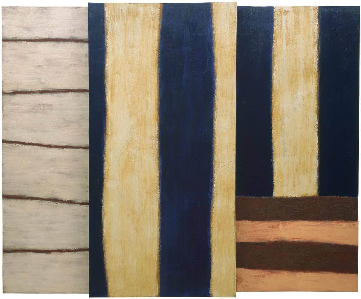
If you’re a devotee of Sean Scully’s earlier work, this has been a good year for you. In the spring, Cheim and Read hung an excellent and quite surprising show of the painter’s work from the 70s in a raw, industrial space in Queens. In September, Mnuchin Gallery followed with a selection of Scully’s work from the 80s. Mnuchin is located in a lovely upper east side town house, and the contrast of the two spaces seemed to track Scully’s change in fortunes over those two decades. A lot of Sean Scully all together is not always a good thing – I can remember thinking that much of the Met exhibition in 2006 felt sodden and repetitive – but the curation of the Mnuchin show was just about perfect; it highlighted all of Scully’s strengths: unusual color groupings, scale, both in the overall sense and in the orchestration of it’s change from section to section, surprising spatial fractures created by multiple canvases, and that distinctly European sense of longing and melancholy. It was difficult to decide which canvas to highlight in this limited space because the entire ground floor was so good, but the two-level No Neo from 1984 was a real knockout. At ten feet across and with its central panel aggressively jutting out into the viewer’s space it felt much like a stage set. But unlike many pictures that flirt with objecthood, it remained spatial in the painterly sense (as opposed to the literal sense) and also proved beyond a shadow of a doubt that Scully can maintain his gravitas while using colors that are undeniably cheerful.
The 1500-word mark is approaching fast, so briefly:
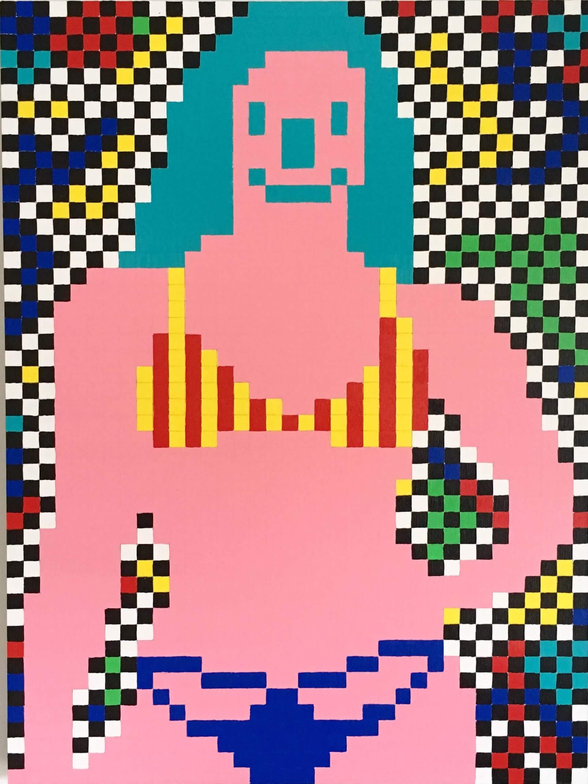
Robert Otto Epstein’s solo effort at Simuvac Projects in Brooklyn is a mix of his gridded works and his stylized, outsider-ish portraits. The lo-fi, pixellated bathing beauties were a lot of fun – if Space Invaders featured pin-up girls, this is what they would have looked like. Jeff Fichera is a young painter whose work I’ve been following for a while now. He has a large canvas called Shimmering Substance #7 in a group show at TSA New York, in which the gridded motif he’s been working with for several years, based on reflections from a holographic shopping bag, comes together at a new plateau of maturity – the color, light, surface, and part-to-part relationships are clicking as one. Half-way between the mega-galleries Petzel and Hauser and Wirth you’ll find a funky little cinder-block space with seven foot ceilings – it’s called Makebish Gallery, and it’s currently featuring a small selection of abstractions from veteran NYC painter Les Rogers. There are a lot of painters in New York channeling Philip Guston right now, but Rogers has a way of using the good parts, like the unselfconcious mark, and editing out the bad, like the muddy colors. There was no checklist online or in the gallery, but if you go make sure to check out the lovely, Guston-esque bouquet just to the right just as you enter.
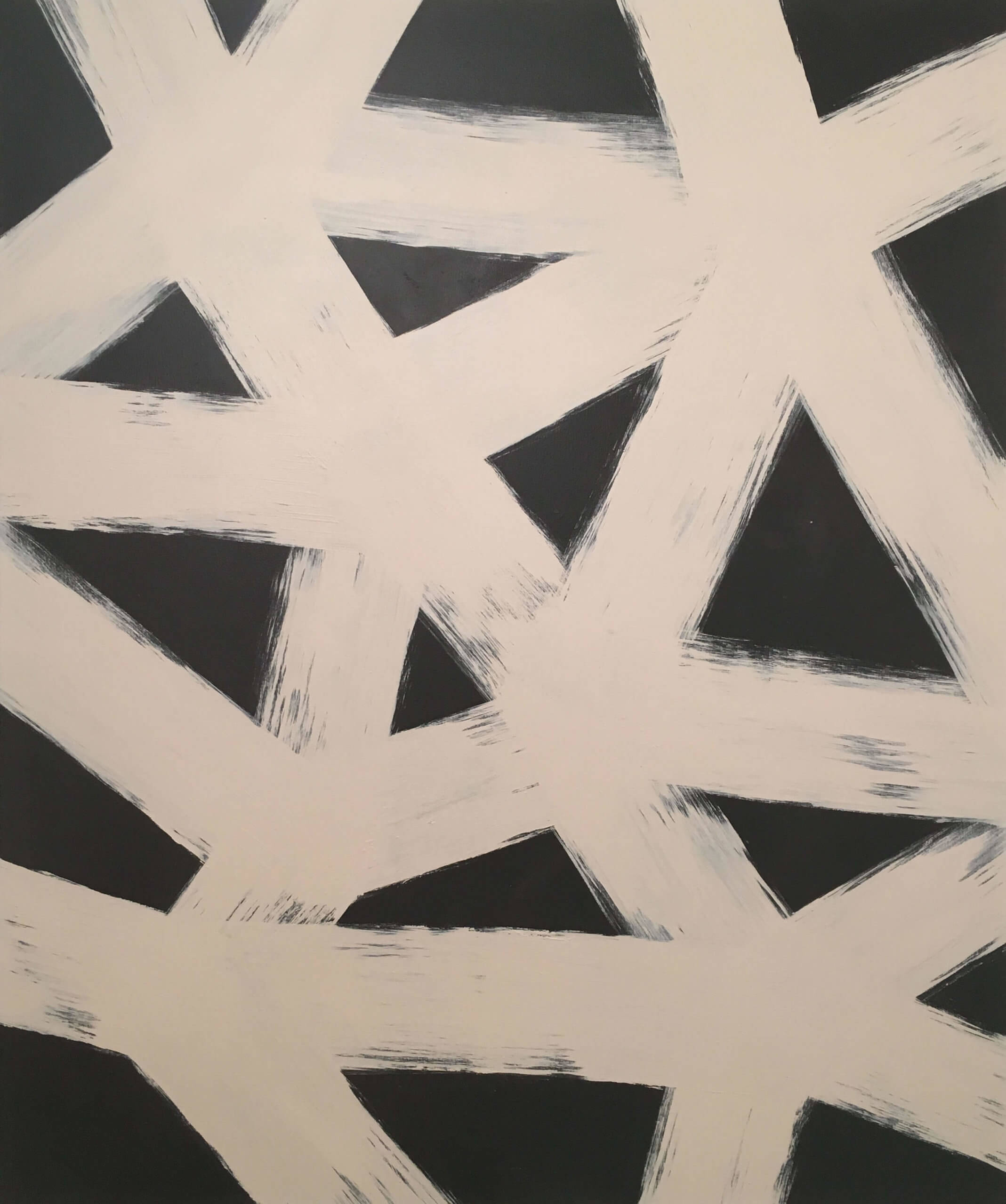
Ivo Ringe’s solo exhibition at Hionas Gallery was uneven, which is not surprising, since the whole shooting match was painted right there in the gallery in the month before the show went up! There are some real high points, though – especially the muscular Friday Night in black and off-white. It looks like it took about a half an hour to paint, and that’s part of what makes it great – I wish I could make that many good decisions in thirty minutes. Key Projects hung a lovely selection of small scale abstractions from Brooke Nixon and Nancy White. Nixon’s hard-edge, highly saturated diamonds felt like bright summer days, and White’s richly dark, close-valued curves looked like evening. Special kudos to the curators for the smart pairing – the show was like a little box of jewels. Sarah Walker’s obsessive, psychedelic abstractions at Pierogi don’t look like anything anyone else is doing right now, and with the thousands of painters running around New York right now, that counts for a lot, no?
—Paul Corio, September, 2016
