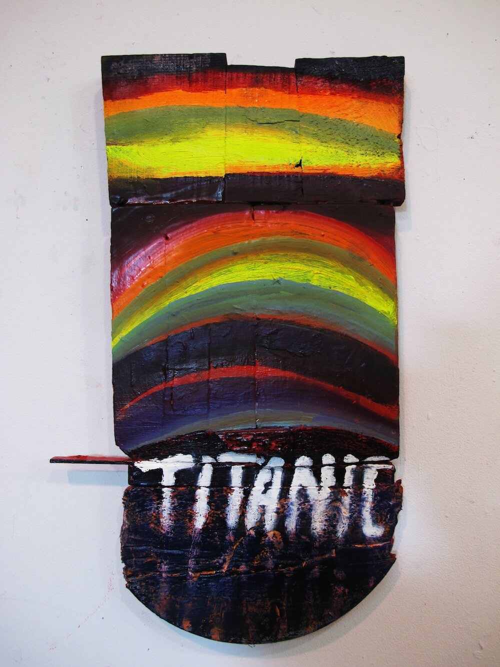
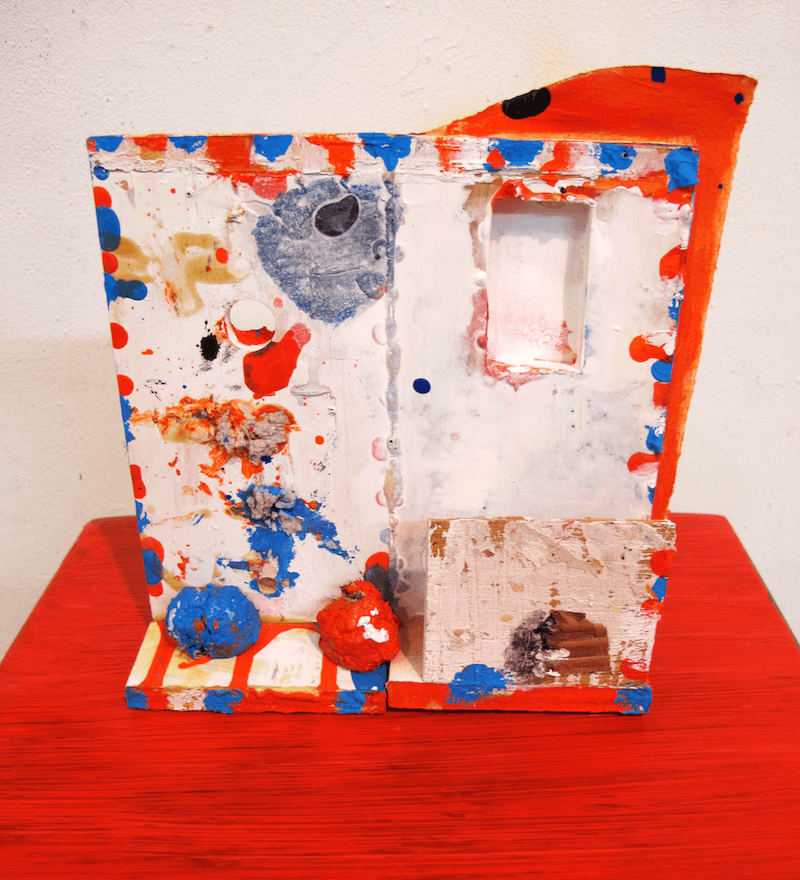
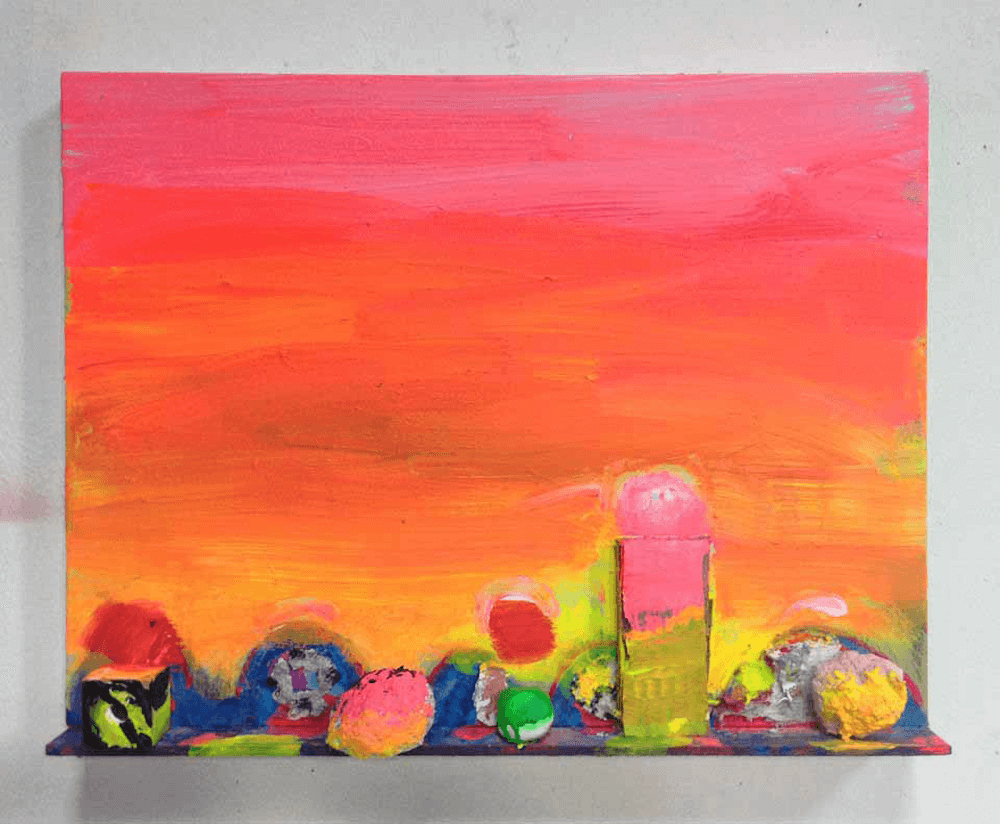
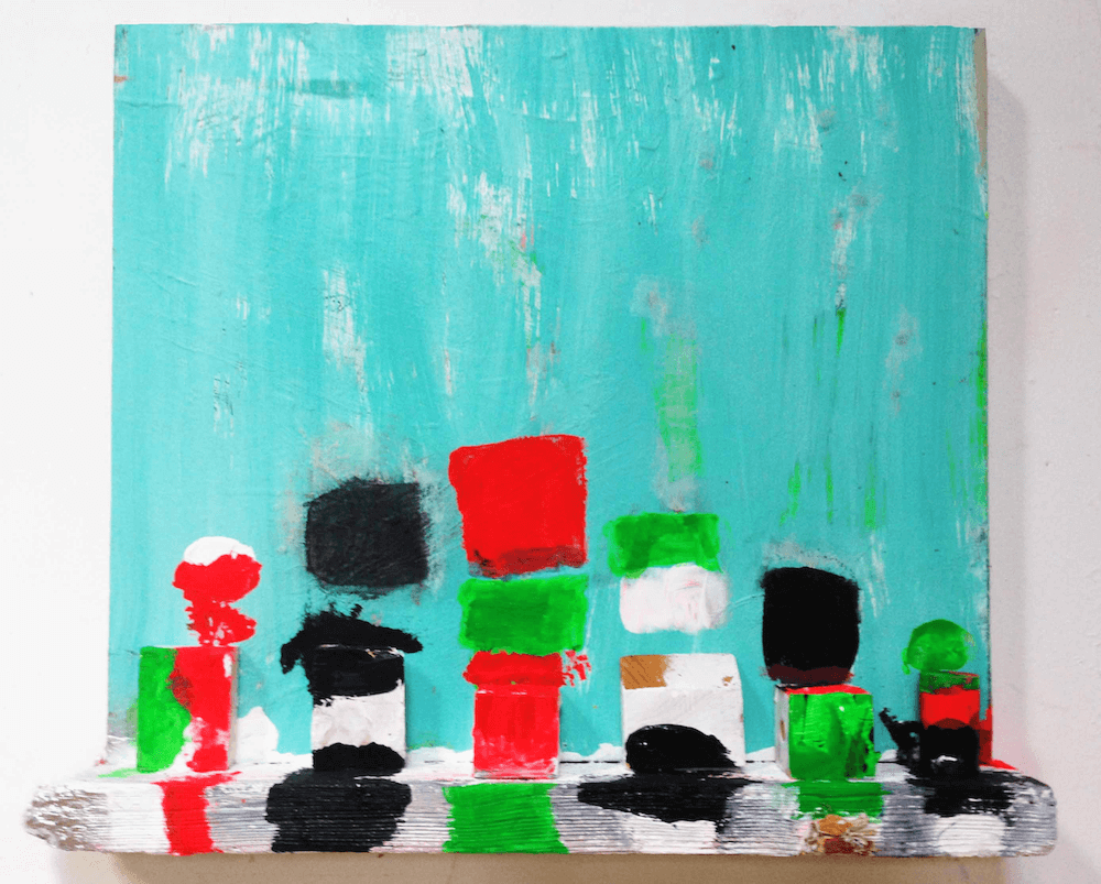
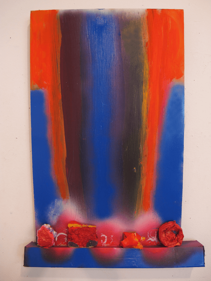
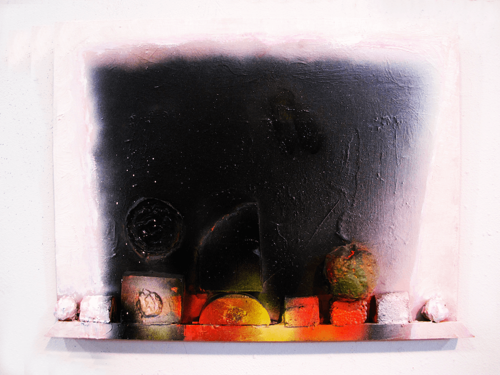
In a new video by Carol Saft, painter Katherine Bradford discusses her recent “shelf” paintings on view at Arts+Leisure, New York from November 15 – December 14, 2014. Bradford remarks that the shelf element developed out of an interest in developing the “sense of weight and gravity” in her work.
The gallery materials note that “as is always the case with [Bradford’s] work, the real subject is invariably paint itself, in all its multi-hued, crusty, clunky, gooey, crumbly, smeared and expressed glory. Her shelf paintings reference the horizons and brute forms of Philip Guston as much as the armature and palette of Howard Hodgkin, and the distortion and nautical humor of Malcolm Morley; her palette blows hot and cool but her signature playful line and irreverent charm shine through consistently in every piece.”
If the video does not appear please refresh the page or click here.